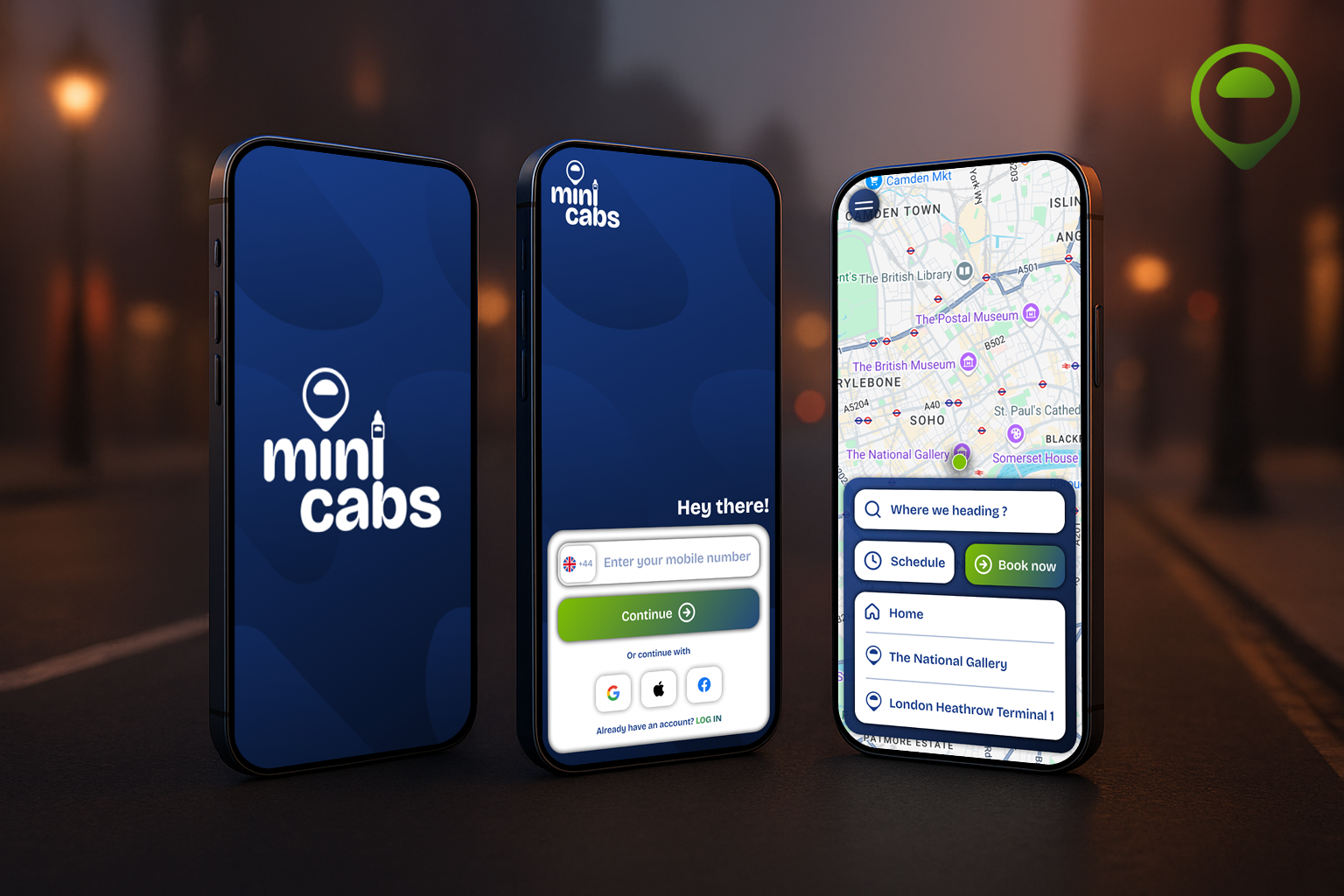
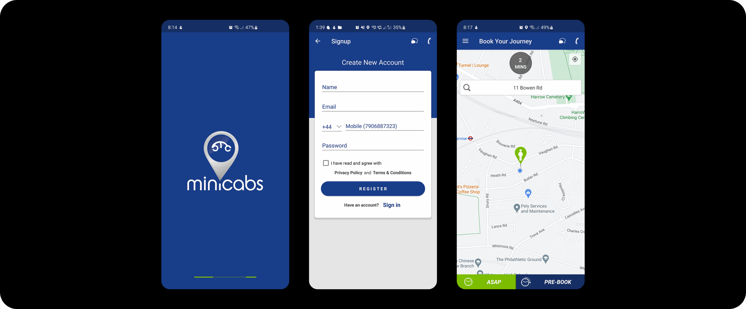
Mini Cabs
Booking reliable, affordable rides in London with a modern, user-friendly app.
Role
UI/UX Designer
Idea Generation, UI Design, UX Research, Wireframing, Prototyping
Status 🔴
Ongoing
Year
Feb 2025
Description
Minicabs is a trusted London-based cab service with over 20 years of experience. Known for reliability and affordability, the brand faced an urgent need to modernize its digital presence to keep up with user expectations in the ride-hailing industry.
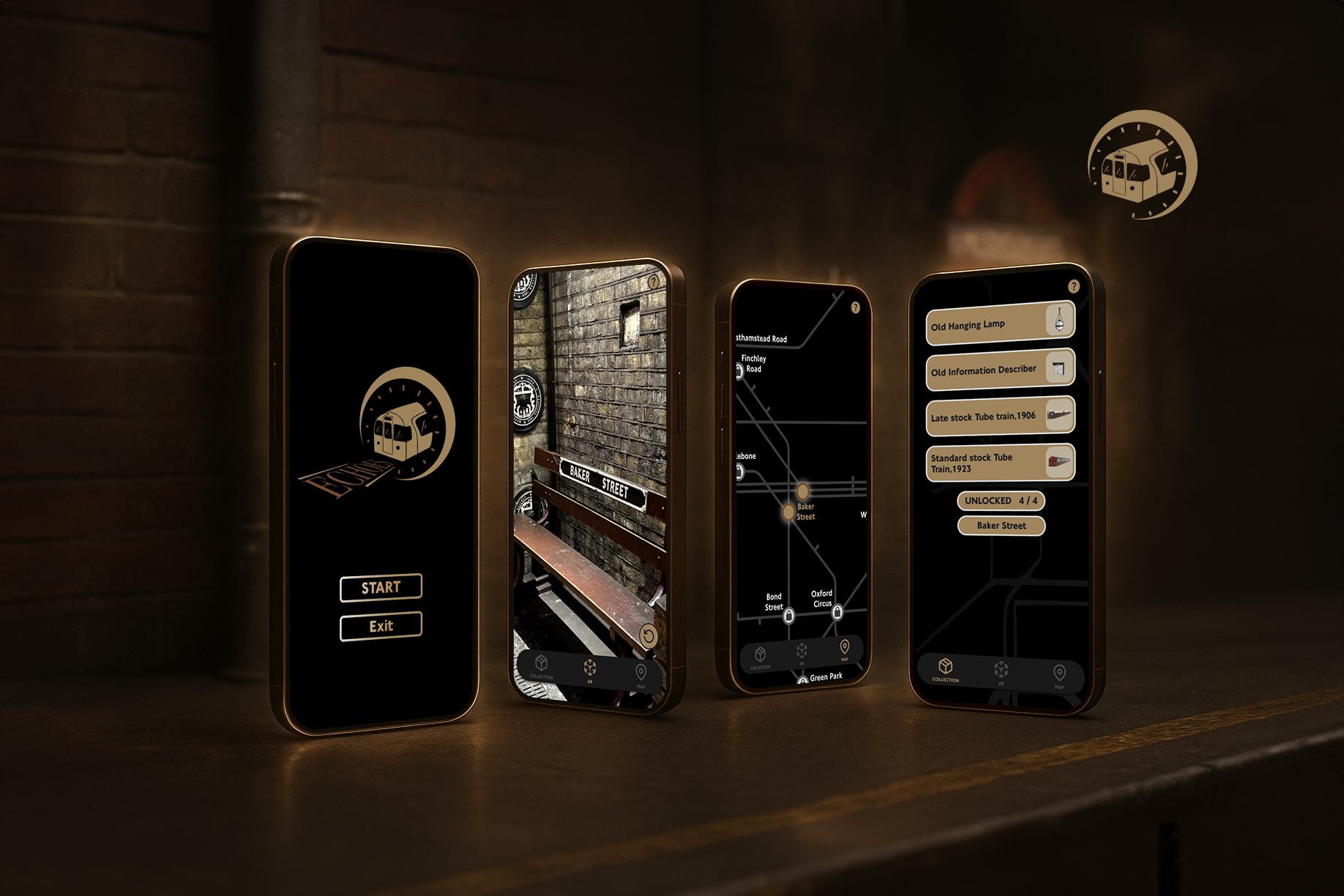
INTERACTIVE PROTOTYPE
CHALLENGES
Through interviews, surveys and testing, I uncovered the following issues:
- A fragmented user experience across platforms
- Complex booking flows with unclear navigation
- Poor mobile usability (small CTAs, slow GPS loading)
- A lack of visual trust signals (no driver ID, fare uncertainty)
- An outdated and inconsistent brand appearance
SOLUTIONS
I will address these challenges by:
- Designing a unified experience across web and mobile
- Simplifying booking flows with location shortcuts and one-tap rebooking
- Improving mobile usability with large CTAs and sticky bottom navigation
- Building trust through verified driver profiles, live tracking, and fare previews
- Refreshing the brand with a modern, consistent visual identity
UX GOALS
- Build trust through design with verified driver details & live tracking
- Create a unified digital experience across platforms
- Make ride booking under 30 seconds
- Ensure mobile-first usability and responsive design
- Provide transparent pricing and quick payment options
BEFORE & AFTER
USER PERSONA
Chloe, 29
Occupation: Marketing Executive
Location: Clapham, London
Behaviors: Books 3–5 rides/week, mostly from mobile
Pain Points:
- Long booking processes
- No fare clarity
- Doesn’t trust apps without verified info
USER INTERVIEW
Participants: 4 users (mix of frequent and occasional minicab users)
Method: 30-minute Zoom interviews (recorded and transcribed)
Goal: Understand user frustrations and expectations
-
I conducted 4 user interviews (frequent and occasional minicab users) to identify core frustrations and needs.
-
Analyzed App Store and Play Store reviews, which revealed common complaints about:
-
Poor GPS accuracy
-
Small, hard-to-tap buttons on mobile
-
Confusing and lengthy booking steps
-
-
Insights from all sources pointed to a need for:
-
Faster, simplified booking flows
-
Clear fare estimates and driver information
-
Stronger safety and trust signals integrated into the UI
-

USABILITY TESTING
Goal: Detect key friction points and accessibility failures.
Tools used: Google Lighthouse.

COMPETITOR ANALYSIS

USER JOURNEY

AFFINITY MAPPING
Grouped themes from user interviews, surveys, and testing.
- Trust & Safety
- Flow Complexity
- Mobile UX
- Brand Identity

These insights shaped the design priorities, feature roadmap, and visual refresh.
IDEATION & UX STRATEGY
I focused on:
- One-tap rebooking
- Auto-suggestions for frequent locations
- Fare preview with driver info
- Live ETA + driver identity
- Sticky CTAs and bottom nav for mobile
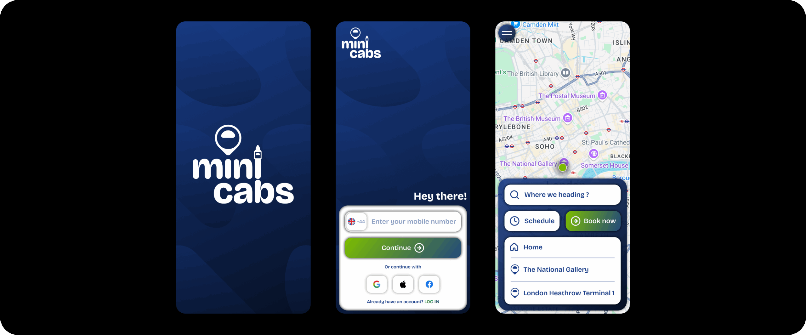
SIMPLIFIED USER FLOW
- Onboarding – Phone + Apple/Google ID login
- Home – Book now / Schedule ride with location shortcuts
- Vehicle Selection – Price + ETA + Driver
- Payment – Multiple methods + summary
- Live Ride – Driver tracking + communication
- End Ride – Feedback, tipping, rebooking
DESIGN SYSTEM OVERVIEW

WIREFRAMES & PROTOTYPES
RESEARCH & FINDINGS
Interested in reading the whole report?
Click Here (This is a work in progress)