Polestar HMI Redesign
A redefining digital experience that simplifies vehicle interactions while reflecting Polestar’s modern and sustainable identity.
Project background
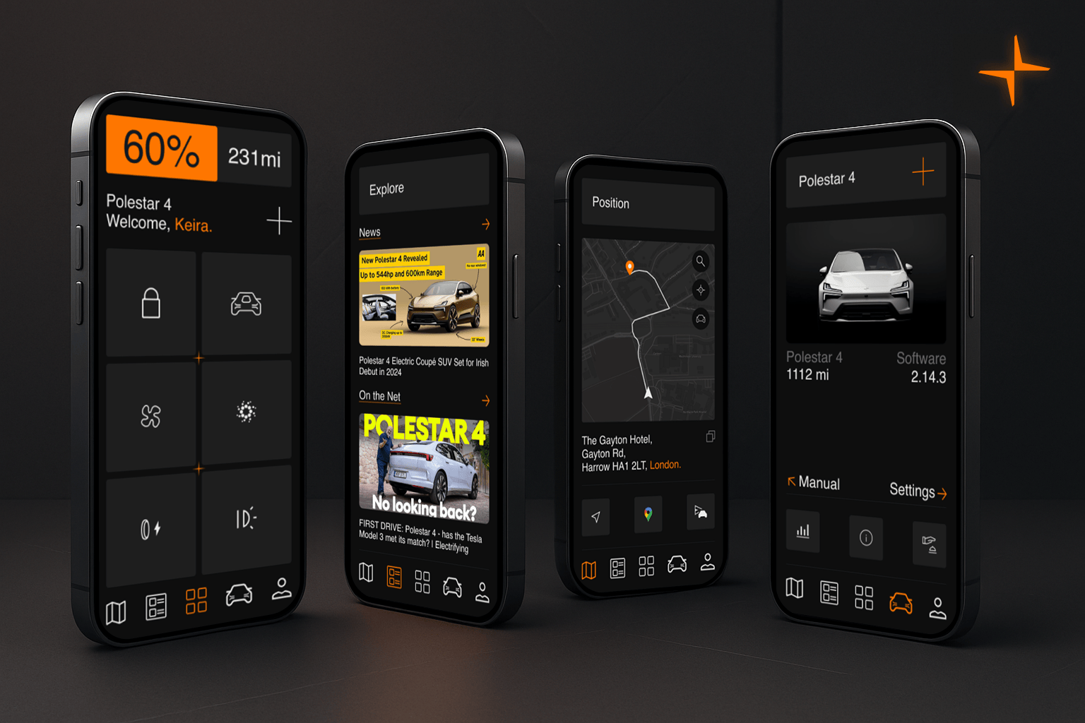
Polestar, a premium electric vehicle brand, is renowned for its minimalist Scandinavian design and commitment to sustainability. The existing Polestar HMI, while functional, was reported by users to lack features like gesture-based shortcuts, customizable displays, and real-time energy insights that align with the modern EV driver’s needs This project aimed to redesign Polestar’s driving experience by creating a sleek, user friendly interface that stays true to Polestars minimalist brand ethos by adding customizable menus while improving the intuitiveness of navigation and control systems.
Design Concept
The design concept was inspired by simple block widgets to make the home screen customizable while maintaining Polestar’s minimalistic look and feel, the design elements have a blocky minimalistic feel to it. The colours used for the design are all from the existing design system with Orange being the primary color.
Softwares Used
- Figma
- Adobe Photoshop
- DaVinci Resolve
- iMovie
Process
1. Discover
- Interviewed Polestar drivers to understand key pain points.
- Conducted competitor analysis, focusing on premium EV brands.
2. Define
- Synthesized findings into a user journey map highlighting friction points.
3. Develop
- Created a high-fidelity design incorporating customisability and dynamic widgets.
- Prototyped features like resizable widgets.
4. Deliver
- Finalized a design system ensuring consistency across screens.
Research
- Studied Scandinavian design principles.
- Analyzed user preferences for dashboard layouts and energy consumption displays.
- Conducted A/B testing for layout optimization.
Design Goals
- Create a minimalist interface emphasizing clarity and focus.
- Introduce customisable widgets for essential features.
- Incorporate quick action actions for widgets into the home screen.

