Polestar HMI
Simplifying vehicle interaction through a modern & sustainable digital experience for Polestar.
Role
UI/UX Designer
Idea Generation, UI Design, UX Research, Wireframing, Prototyping
Client
Final Major Project
Tools
Figma & FigJam
Status 🟢
Completed
Year
Aug 2024
Description
Polestar is a premium automotive brand renowned for its innovative electric vehicles and commitment to cutting-edge technology. Recognized for performance and sustainability, the brand provided the perfect opportunity for me to redesign its Human-Machine Interface (HMI) as part of my Final Major Project, with the aim of enhancing its digital experience to meet evolving user expectations in the connected car space.
INTERACTIVE PROTOTYPE
CHALLENGES
Through driver interviews, surveys, and competitor research, I uncovered the following issues:
- Buried controls for core/frequently used functions
- Static display layout with no customisation
- Inconsistent navigation and control systems
- Reliance on Google ecosystem with minimal flexibility
SOLUTIONS
I addressed these challenges by:
- Making buried controls easily accessible
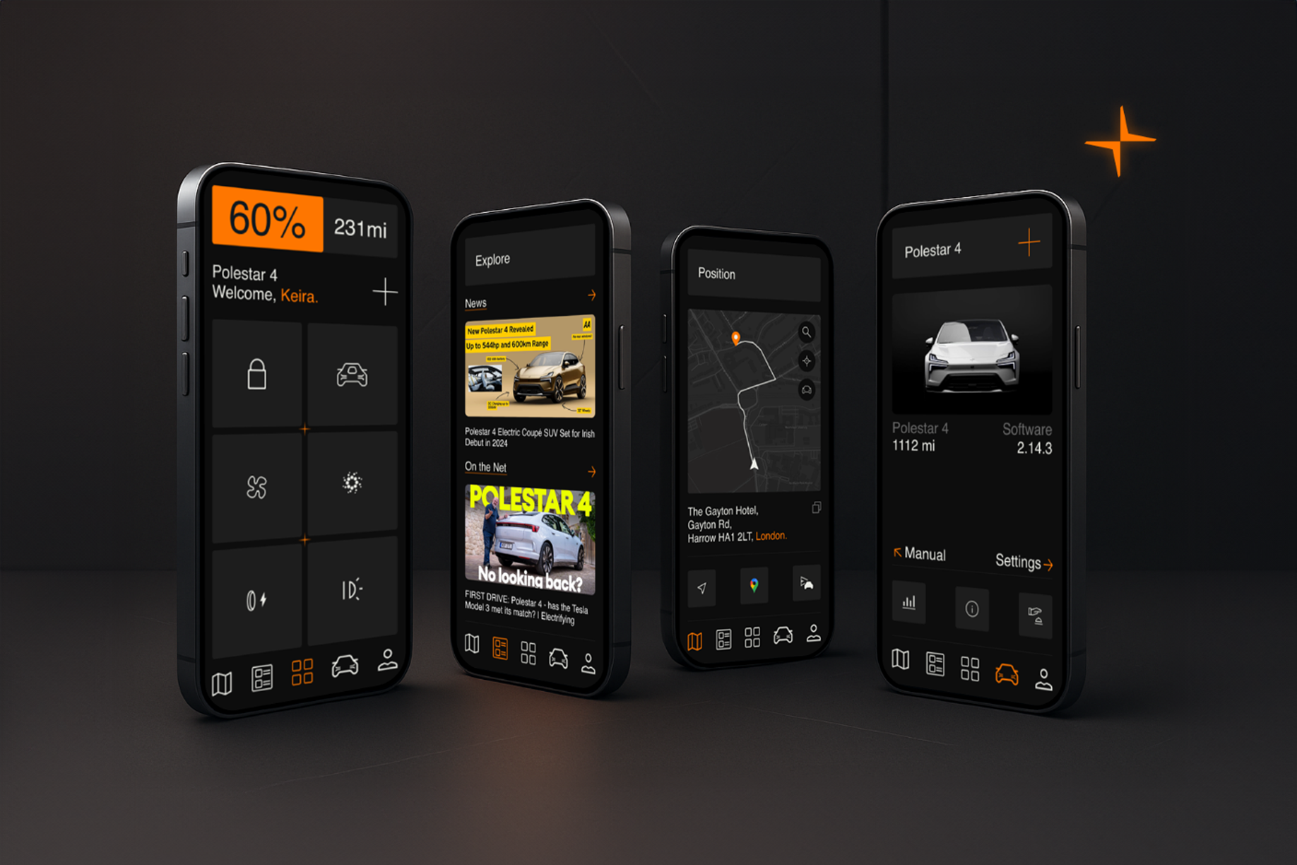
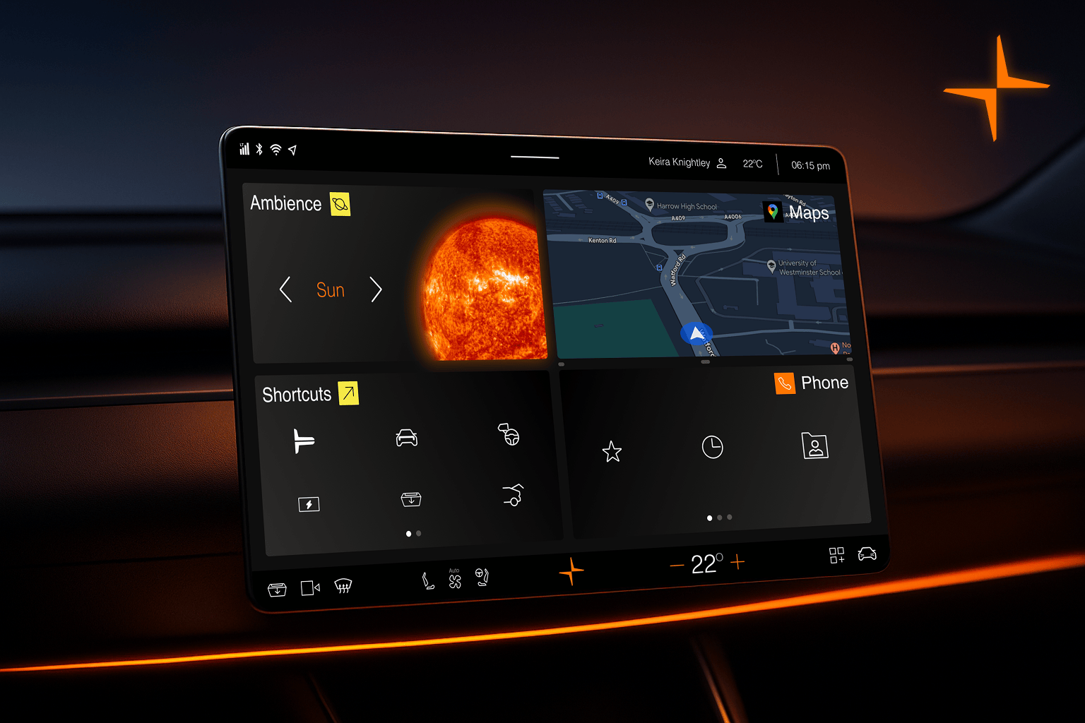
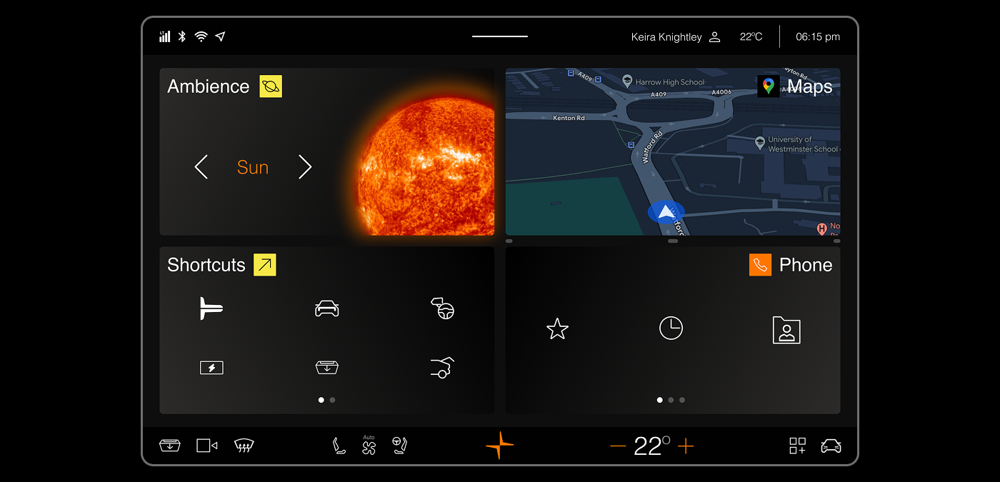
- Introducing block-based widgets for a fully customisable home display
- Adding resizable map widgets and quick toggles for driving modes
- Aligning visuals with Polestar’s minimalist design system, using brand colours with Orange as the primary highlight.
UX GOALS
- Simplify the user journey for in-car controls and status checks
- Enable real-time customisation of the interface through widgets
- Reduce driver distraction by decluttering and embracing minimalism
- Strengthen Polestar’s modern, sustainable digital identity through clear visual hierarchy
BEFORE & AFTER
USER PERSONA

USER INTERVIEW
Participants: 4 Polestar owners
Method: 30-minute remote interviews & surveys
Goal: Identify daily frustrations and features users wish existed in the HMI
Findings included:
- Desire for custom widgets (maps, climate, media)
- Resizeable Widgets
- Quick Access to frequently used buttons (Glovebox, Camera, Defroster)

USABILITY TESTING
Goal: Validate how drivers interact with the redesigned widget system
Method: Prototype testing & scenario tasks (e.g., extend map, swipe widgets)

COMPETITOR ANALYSIS
Compared Polestar’s current HMI with Tesla’s and BYD’s:
- Tesla: Frequent OTA updates, but heavy touch dependence
- Rivian: Great UI, but complex menus
- Opportunity: Combine Polestar’s premium brand with practical customisation and dynamic yet simple menus & widgets

USER JOURNEY
Mapped user flow from Car Start to confirming tasks:
-
Power on → Home screen widgets → Swipe to expand map → Open Glovebox → Complete Actions → End drive

AFFINITY MAPPING
Grouped insights from interviews, surveys, reviews and tests to highlight themes:
- Action Feedback
- Quick Access to Controls
- Smooth Transitions
- Personalization

These insights shaped the design priorities, feature roadmap, and visual refresh.
HOW MIGHT WE ⁉
How might we enable Polestar drivers to personalise their interface for a safer, more intuitive and delightful driving experience?
IDEATION & UX STRATEGY
Focused on:
- Widget-first homepage
- Dynamic resizing of map & climate widgets
- Stacked settings panels for clearer hierarchy
- Seamless integration with Polestar’s minimal brand DNA
SIMPLIFIED USER FLOW
- Power On →
- Home Screen (widgets) →
- Swipe/Resize Widgets →
- Access Quick Settings →
- Confirm & Drive.
DESIGN SYSTEM OVERVIEW
Design aligned with Polestar’s minimalist aesthetic, focusing on clear iconography, ample spacing, and light/dark mode adaptability in the future.

RESEARCH & FINDINGS
Interested in reading the whole report?
Click Here
BLOG
Interested in reading more behind the scenes?
Click Here